Graphics Mode
Panorama forms operate in two distinct modes – data access and graphic design mode. Data access mode (also called “data mode”) is the default mode. In this mode you can view and display data, and navigate through the database.
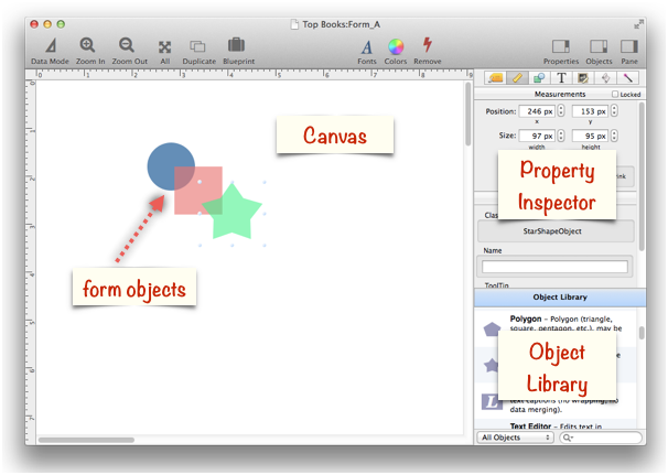
Graphic design mode (also called graphics mode) functions like an electronic drafting table. In this mode you design the form by drawing lines, boxes, and other graphic elements. This mode is very similar to many drawing and page layout programs. Graphic design mode is easily recognized by the rulers that appear at the top and left edges of the window, and the inspection palette that appears on the right side of the window.

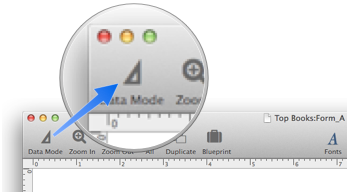
To switch between data access and graphic design modes, click on the leftmost tool in the tool palette. Each click on this tool toggles the window between the two modes.

To learn more about Graphic Design Mode see the topics below:
- Aligning Objects -- so that one or more object edges are made even with each other.
- Automatic Form Construction -- creates a column of form elements for editing data fields (or variables).
- Automatic Mailing Label Construction -- creates a mailing label.
- Cocoa Objects -- discussion of how objects are implemented in Panorama X compared to earlier versions
- Creating a New Form Object -- with the Object Library.
- Data Button Object -- is used to create checkboxes and radio buttons.
- Displaying Data in a Grid -- fundamentals of displaying data in a grid (Text List/Matrix).
- Duplicating Objects -- to make copies of one or more objects.
- Fixed Image Object -- is used for fixed images (images that never change).
- Fonts -- setting the font and text size of form text objects.
- Form Object Appearance -- changing the color, fill, stroke, opacity and drop shadow attributes of selected objects.
- Form Object Blueprint -- display and edit raw object specifications
- Form Object Code -- associating programming code with an object
- Graphics Mode -- is used to edit the graphic design of a form.
- Grouping Objects -- allows you to manipulate multiple objects as if they were a single object.
- Image Display Animations -- animated images.
- Image Display Colors and Gradients -- displaying pure colors and gradients
- Image Display Data Buttons -- checkboxes and radio buttons created from custom images.
- Image Display Object -- is used for dynamic images (images that change depending on the data).
- Image Display Push Buttons -- push buttons created from custom images.
- Line Object -- draws a line within a form.
- Matrix Clicking -- handling clicks in a Matrix Object.
- Matrix Constructor -- quickly creating a Matrix Object from a template.
- Matrix Database Integration -- synchronizing a Matrix Object with a database.
- Matrix Geometry -- customizing the size and geometry of Matrix Object elements.
- Matrix Header and Horizontal Scrolling -- setting up a custom header for a Matrix Object grid.
- Matrix Object Frame -- setting up the arrangement of items within a Matrix Object.
- Matrix Object -- displaying a grid of items with a custom arrangement.
- Object Inspector Panel -- is used to view and modify the attributes of selected objects in a form.
- Object Library -- is used to create new objects in a form.
- Oval Object -- draws an oval or circle within a form.
- Polygon Object -- draws a polygon within a form.
- Popup Menu Button Object -- is used to create popup menus anywhere on a form.
- Push Button Object -- triggers a procedure when it is pushed.
- Rectangle Object -- draws a rectangle or square within a form.
- Report Tile Object -- component for assembling a custom report.
- Rich Text -- is used to display styled text, including bold, italic, colors, tabs, even images.
- Rounded Rectangle Object -- draws a rectangle with round corners within a form.
- Scroll Bar Object -- is used to create scroll bars.
- Segmented Button Object -- is used to created segmented buttons.
- Selecting Form Objects -- so that they can be modified.
- Slider Object -- is used to create sliders and knobs.
- Smart Resize -- adjusts the sizes and locations of the other selected objects to match the change of one object.
- Star Object -- draws a star within a form.
- Stepper Object -- is used to create numeric steppers for use with Text Editor objects.
- Tab Panel Appearance -- appearance options for a Tab Panel Object.
- Tab Panel Buttons and Selection -- button options for a Tab Panel Object.
- Tab Panel Constructor -- quickly creating a Tab Panel Object from a template.
- Tab Panel Content -- setting up the content for a Tab Panel Object.
- Tab Panel Forms -- setting up the forms for a Tab Panel Object.
- Tab Panel Object -- switchable tab panels.
- Text Display Object -- is used to display text using a formula.
- Text Editor Object -- is used to edit text in a field or variable.
- Text Label Object -- displays a short, fixed, text item within a form.
- Text List Appearance -- customizing the appearance of a Text List Object.
- Text List Constructor -- quickly creating a Text List Object from a template.
- Text List Database Integration -- synchronizing a Text List Object with a database.
- Text List Multiple Columns -- displaying multiple columns in a Text List Object
- Text List Object -- displaying a grid of text.
- Text List Programming -- programming a Text List Object.
- Text List Searching -- searching within a Text List Object.
- Text List Selection -- selecting items in a Text List Object.
- Web Browser Object -- is used to display web pages from within a Panorama form.
See Also
- Aligning Objects
- Automatic Form Construction
- Automatic Mailing Label Construction
- Cocoa Objects
- Creating a New Form Object
- Data Button Object
- Displaying Data in a Grid
- Duplicating Objects
- Fixed Image Object
- Fonts
- Form Object Appearance
- Form Object Blueprint
- Form Object Code
- Grouping Objects
- Image Display Animations
- Image Display Colors and Gradients
- Image Display Data Buttons
- Image Display Object
- Image Display Push Buttons
- Line Object
- Matrix Clicking
- Matrix Constructor
- Matrix Database Integration
- Matrix Geometry
- Matrix Header and Horizontal Scrolling
- Matrix Object
- Matrix Object Frame
- Object Inspector Panel
- Object Library
- Oval Object
- Polygon Object
- Popup Menu Button Object
- Push Button Object
- Rectangle Object
- Report Tile Object
- Rich Text
- Rounded Rectangle Object
- Scroll Bar Object
- Segmented Button Object
- Selecting Form Objects
- Slider Object
- Smart Resize
- Star Object
- Stepper Object
- Tab Panel Appearance
- Tab Panel Buttons and Selection
- Tab Panel Constructor
- Tab Panel Content
- Tab Panel Forms
- Tab Panel Object
- Text Display Object
- Text Editor Object
- Text Label Object
- Text List Appearance
- Text List Constructor
- Text List Database Integration
- Text List Multiple Columns
- Text List Object
- Text List Programming
- Text List Searching
- Text List Selection
- Web Browser Object
History
| Version | Status | Notes |
| 1.0 | No Change | Carried over from Panorama 6.0. |